
2024 NHL Faceoff Ups & Downs
- TheFaceoff.net

- Dec 31, 2023
- 6 min read
Updated: May 15, 2024

UP - Anaheim Ducks
I have never been too impressed with a Ducks center ice since they ditched the Mighty Ducks brand, so bringing back of piece of it was bound to score a few points with me. But what sets it over the top is the roundel including both the current and previous team names. Since it is an anniversary logo, we won't see it again, but I would love if they found a way to incorporate the roundel into future looks. Also, please bring back the Mighty Duck for good.


UP - Arizona Coyotes
This is a big up. It would be hard for them to impress me much given the restrictions set in place due to their shared arena situation. The last two seasons at Gila River Arena were perfection on ice. The addition of a checkered red line adds a touch of detail to the ice which it needed. The less obnoxious arena text is nice too.


UP - Boston Bruins
How cool is it to see this throwback logo taking up the entire center circle. That said, I prefer their normal logo. The Bruins are only using this logo one time, to celebrate their 100'th Anniversary, so for that reason, I am glad it is on the ice this season.


UP - Buffalo Sabres
The Sabres finally took a page from the Bruins playbook by enlarging their logo so it made up the entire center circle. That alone made this ice nearly perfect, but the team had more in store for fans. The swords in the red line were just the touch to finish it off.


DOWN - Calgary Flames
The Flames returned to their familiar primary logo red line pattern this season. While there is nothing wrong with it, the unique flame design last season was a classy look for the team. I was really hoping they would keep that design at least a couple more seasons.


UP - Carolina Hurricanes
The Hurricanes celebrated their 25'th anniversary last season with a special logo at center ice. This year it is back to the primary logo at center ice. Always good to see the primary eye of the Hurricane at center ice.


None - Chicago Blackhawks
Another season where the only change is whether the center dot lands in the red or in the white on the center line. The Blackhawks have a great center ice, but it might be nice to change it up a little. I can't really give them an up or a down for this.


None - Colorado Avalanche
The Avalanche do not change up their ice much. While a new center line design would be fun, they have had the current one since they first started playing in Pepsi Center (now Ball Arena.) I can appreciate their respect for tradition.

UP - Columbus Blue Jackets
Last season the Jackets moved the arena text to both sides of the center line. It was really the only change that their ice needed, and I am glad they kept that design for this season.

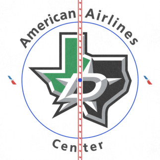
UP - Dallas Stars
The Stars have brought back their Texas outline alternate logo to center ice. We first saw this look in the 2021/22 season, and it was a shame to see it go away last year. The one drawback this time around is the new arena wordmark surrounding center ice. The old look was better, but the logo is enough to make this an "Up."


UP - Detroit Red Wings
First off, let me say that I am in the camp that never wants to see "Hockeytown" written across the logo ever again. Why anyone would want to tarnish such an iconic logo, I will never understand. The Red Wings have nearly the same checkered red line pattern since the 1963/64 season, so a major change was not expected. The Red Wings stead gave us a very similar checkered red line, while adding the winged wheel logo to the red spaces between each white box. A subtle change, but a good one.


UP - Edmonton Oilers
I have been uploading concepts for several years with an oil drop red line, so imagine my excitement to see it become a reality. In my concepts, I used an inverted design where the inside of the red line was white, and the oil drops were red. I chose this because it would be a nice callback to the many years at Northlands Coliseum.


UP - Florida Panthers
The Panthers went two seasons with no corporate arena name which allowed for a clean look at center ice. With a new arena name, it was no surprise to see text around the circle once again. While the text colors reflect the branding of Amerant Bank, they clash with the colors of the Panthers logo.
While the arena name is disappointing, it can't really be helped. However, the Panthers use of the 30'th anniversary logo on the ice brings back the Panther breaking a hockey stick logo that has been sorely missed.


DOWN - Los Angeles Kings
The Kings only changed the arena wordmark placement this season by moving it to the sides. While this move gives the center ice a symmetrical look which is more pleasing to the eye, I simply cannot give them an UP until they replace that horrible home plate logo.


NONE - Minnesota Wild
The Wild made no real changes to their center ice this season.


DOWN - Montreal Canadiens
The Canadiens made no changes to their center ice this season. I would like to see the arena logos go back to the four corners of the circle rather than the sides, and perhaps go back to the dual logo format for the team logo.


DOWN - Nashville Predators
The Predators are celebrating their 25'th anniversary with a special logo at center ice. Unfortunately, the logo just doesn't quite live up to the normal center ice look with the primary logo.


NONE - New Jersey Devils
The Devils did not make any changes to their center ice this season.


UP - New York Islanders
The Islanders logo looks great at center ice. I would be hard to imagine any future anniversary logo being good enough to warrant placing it at center ice. Last year's anniversary logo is one of the worst we have seen on ice. So glad it has been replaced.


NONE - New York Rangers
No change to the New York Rangers center ice this season. While they have a great center ice, it might be about time for a change.


DOWN - Ottawa Senators
The Senators have kept their center ice the same for four seasons now. The only problem I have with it is that the arena wordmark is so large that it feels like it overpowers the team logo.


UP - Philadelphia Flyers
The Flyers have listened to their fans and reverted back to a dual logo layout and brought back their popular center line design.


NONE - Pittsburgh Penguins
The Penguins made no changes to center ice this season.


UP - San Jose Sharks
The Sharks brought the biggest surprise this season by bringing a brand-new look to center ice without the excuse of an anniversary or a primary logo change. The shark fin look is beautiful, while the candy stripe shark fin center line completes the look. Can we give this one a Super Up?


None - Seattle Kraken
Three seasons in, and the Kraken have had the same ice each season. It is a great look but would love to see them change up something.


DOWN - St. Louis Blues
The Blues made no changes to their center ice again this season, but they should have. The Blue note is iconic, but also lacks the ability to provide balance to the center ice circle. Moving the Enterprise Center text to the sides of the circle would help balance things out. Also, it is time for a better (or any) center line design.


UP - Tampa Bay Lightning
The Lightning have gone back to their primary logo this season which is a bold and clean look. I just wish they would dry something new with the center line. It is a bit distracting as it is.


UP - Toronto Maple Leafs
No change this season for the Maple Leafs, but honestly, I can't think of anything that would improve it.


NONE - Vancouver Canucks
The only change this season is the center line pattern being inverted horizontally. I really have no thoughts on that. It seems to make no difference in the overall look.


UP - Vegas Golden Knights
Each season the Vegas Golden Knights have brough us a unique new look. This season they incorporated their Stanley Cup Championship into the design. I look forward to their work each and every season. I also think this logo is a step up from the previous season.


DOWN - Washington Capitals
This is still the worst center ice in the NHL in my opinion. The Weagle would look SO much better. The lack of effort to even move the text around so the red line doesn't cover it is laughable.


DOWN - Winnipeg Jets
The Jets made their arena text larger and lost the "life" box emblem. Somehow this just looks a bit generic. My guess is Canada Life did not feel like people could read their logo very well.


What are your thoughts on this year's center ice designs? Let us know in the comments or on Threads.


Comments