


Fixing 2027 NHL Center Ices

Having reviewed all the center ice designs for the NHL's 2026/27 season, I wanted to take a moment to examine a few of them and offer suggestions for future improvements. We'll begin with what I consider the most significant issues and proceed to smaller critiques.
My opinion on the Washington Capitals remains unchanged: I consistently think they have the league's worst-looking center ice. The 'Weagle' logo would be an excellent choice for center ice, as their main logo is partially hidden by the center line. It's evident that no consideration or effort is put into how the "Washington" text interacts with the line. Using the secondary logo along with arena text on the sides would provide a balanced and striking appearance.
As a fan of the St. Louis Blues, the ice design really bothers me. I appreciate our logo, but it doesn't look well-balanced within a circle. This means the arena text is left to balance things, but each year, it just disrupts the balance even more. My suggestion is to have either two arena names, one on each side, or ideally, four wordmarks like they used to have with the Scottrade Center.


I was surprised that the Columbus Blue Jackets didn't take advantage of the new hollow center line that the NHL has permitted teams to use starting from the 2023/24 season. The line completely covers the peak of their star.


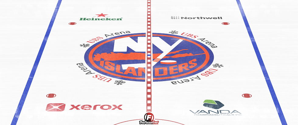
The New York Islanders are another team that could significantly gain from utilizing the hollow center line, enhancing the brilliance of their iconic logo.

The Detroit Red Wings might consider using the hollow center line to address the awkward positioning of the "Hockeytown" text, possibly relocating the arena name to the sides of the circle for better balance.


The ice at the Minnesota Wild arena is decent, but the wordmark on the arena is unbalanced. Shifting it to the side could create better balance and reduce distraction.


Finally, the Anaheim Ducks have a beautiful center ice design, which I believe could be enhanced by relocating the arena text to the sides. As a rule of thumb, if the text isn't evenly positioned on both sides of the center line, it should be moved to the sides.


If you're curious why I didn't use the hollow center line for the Edmonton Oilers, it's because I tried it and found it unhelpful. The current design, with the "Oilers" text on either side of the line, actually looks better.
We'd love to hear your thoughts and any suggestions you might have.


Comments