
History of the TheFaceoff.net
- TheFaceoff.net

- Aug 2, 2022
- 9 min read
Updated: Dec 1, 2023

The Beginning
The center ice archive did not start out of a love for center ice designs, or even a decent knowledge of center ice designs. It was not an obsession, or even a fascination. At that time, I was barely even aware that ice designs ever changed. As for red line designs, I just assumed every team used checkered or diamond red line patterns. In reality, it started with a love of the St. Louis Blues and a love of graphic design.
I started watching hockey quite randomly one October evening in 1998. I was 13 and living in a community where hockey was just a sport that is played somewhere else in the country. Nobody I knew could have cared less about hockey. The game was between the Detroit Red Wings and the Colorado Avalanche. The fast-paced action kept my attention, and I started pulling for the Red Wings. My love of hockey would quickly form, and soon I would learn that there was a hockey team in my very own home state of Missouri. At that point, I knew who I must root for.
Over the years my love of graphic design and hockey would intersect through small, personal projects that nobody else would ever see. Sometime in late 2010, I decided I wanted a desktop wallpaper for my
computer that matched the Blues' playing surface. I wish I still had this graphic. I was proud of it, but by today's standards, I would certainly laugh at the amateur attempt at accuracy.

It was only 1280x720 pixels which was probably already slightly outdated for a standard desktop resolution. The graphic included most of the neutral zone and just a sliver of each of the four defensive zone faceoff circles. The "Scottrade Center" wordmark was probably added to the graphic using a random, bold, san-serif font like Arial Bold. Not accurate, but it got the job done.
The graphic lived on my desktop for some time, and a friend noticed it one day and asked me to make one for his team. After making a Detroit Red Wings ice graphic for him, I decided to post both of them on Facebook. That was it. I was done with making center ice designs.

A month or so passed and someone saw my graphics and asked me for a Philadelphia Flyers ice graphic, followed by Anaheim. At this point I decided to sit down and create a graphic for all 30 teams. I would share them beyond the walls of my Facebook friends list by hastily uploading them to a blog on Blogspot.com. All 30 teams were up in a matter of days. The world could see them, supposing anyone could actually find them at my url: paintedice.blogspot.com. I posted in a few hockey messages boards to let people know they existed. To my surprise, a few people seemed interested in checking them out. Now that little adventure was over. I had fun making them since it combined my love of two things in a unique way. But all 30 teams were done. They were out there for anyone to have if they wanted them. It was time to move on to other things.
Months passed by and it was finally time for the start of a new season. I got an email from someone I knew saying that they had come across my posts on the message boards, and some people were trying to contact me over there. They wanted updated ice graphics. I was a bit confused. There were no new NHL teams, and no teams re-branded that I knew of. I had to head over to the message board to see what they thought had changed that would require a new graphic. It was that moment that I learned that red line designs change year to year, and that some teams like to change up their ice designs. At this point, I knew I had a challenge. Not only would I start making new ice graphics for that new season, but I would also realize how much detail I had missed in the previous graphics. For instance, I didn't know that one team's diamond red line would actually be different than other team's versions of the diamond red line.
With a new batch of ice graphics ready to upload, and backdated graphics improved, I decided I needed a better location to store and display them. Having a "blogspot.com" address was not going to cut. It was also around this time that I started hearing about some teams no longer painting the logos on ice but using fabric logos that could be removed and reused. Naturally, this seemed like the direction the industry would increasingly be heading, so "Painted Ice" would surely be an antiquated title in no time at all. While this is partially true, ten years later, there is a pretty good mix of fabric and hand-painted logos. None-the-less, "Painted Ice" was a pretty generic sounding name. After some thought and research, Frozen Faceoff was born. Please note that it would be two more seasons before the NCHC would reveal the name of their championship hockey tournament, "NCHC Frozen Faceoff".
With a new name and a url to match, the Frozen Faceoff was born April 25, 2012. It consisted of two seasons of NHL graphics, along with ice graphics for the 2011/12 season AHL season. They were being housed on a similar looking (yet still separate) site called Frozen Minors. Hindsight, I could have done better with the name there.


Growing
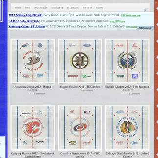
The first year or two with the new site would mostly consist of keeping up with changes each season, while also trying to add in a few historical ices. The history for team's ice designs was limited and spotty. Two hockey aesthetics enthusiasts contacted me in September of 2012. Cory Gibson wanted to point out some fine details on a few of the rinks and provided many reference photos for historical ice designs that were not yet in the archive. A hockey gamer and graphic designer, who went by the username CanuckFanatic92, use material he had already made for custom ice designs for the PC NHL video game series. These two worked with me for years to transform the hit or miss NHL section into the NHL Center Ice Archive we have today. It is a nearly complete history of NHL ice designs from the time they started painting logos on ice. Their attention to detail and accuracy also helped me improve every single graphic on the site.

A few more years would go by, and the site would soon have CHL ice designs added to the archive. The site started to branch out in 2015 with the addition of scoreboard graphics. CanuckFanatic92 had been working on historic scoreboards as well and agreed to work on those for Frozen Faceoff as well.
In 2016 we added goal horns to the site. Information and photos about each NHL team's goal horn were displayed for an aspect of hockey that many fans knew little about at the time. We partnered up with NHL Horns & Songs, a YouTube channel with goal horn audio for all of the teams, along with their goal songs. After he retired from YouTube, we partnered with N2B Alex who brought his goal horn videos as well as 3D animation skills to help us out. Our current goal horn partner is Famous Goal Horns who also operations an interactive goal horn app called Goal Horn Hub.
In early 2019, Ryan (Dryve Graphics) partnered up with us to turn many of our scoreboard renderings into stunning 3D Models. Since then, we have enjoyed watching his new scoreboard site for which we still help provide scoring graphics.
Rebrand and Refocus
2019 was a big year for the site. Earlier in this post, I mentioned that we would share a name with the NCHC ice hockey tournament. It certainly led to some confusion, and I am under no delusion that most of the mis-directed web traffic was trying to find the NCHC site. I also want to make it clear, that we never had any pushback or negative interaction with the NCHC over the shared name. We had the name first, but it was in no way protected so when they named their tournament, it was fair game. No bad blood whatsoever, but I did tire knowing that those who did search for our site would typically land on their site instead. So, it was time for a change.
I am no marketing genius, but I feel like the Frozen Faceoff brand had served me well, and a complete overhaul of the name might lose some followers along the way. In the end, it made the most sense to shorten the name to The Faceoff. On July 1, 2019, the new name and logo was announced along with one of the biggest improvements in the history of the center ice archive.
By 2019 any graphics under 1920x1080 were obsolete. Our ice graphics were so far behind the times. This would be the year that we would turn every one of our neutral zone graphics into full rink graphics. These graphics would include any team specific markings, and the appropriate hockey markings. While this was a 2019 announcement, the prep work for this feat actually began nearly a year in advance.
We celebrated our tenth anniversary of the birth of the center ice archive in the summer of 2021 (dating back to the "Painted Ice" days). This celebration included a brand-new web platform. We had been running off of a heavily modified "Blogger" template for ten years. After months of planning and personally building the site to cater to its unique needs, The Faceoff had a true platform on the web to be proud of.
Other additions to the site included authentic in-ice advertisements for all of the NHL center ice archive, as well other leagues which is still a work in progress at this time. A fan of our site, Shawn Jones, began helping out with reference photos and graphics that have helped improve many aspects of the center ice archive such as advertisement accuracy and rink markings. He has also helped us expand on the history of the CHL center ice archive and include authentic advertisements there as well.

After our 10-year celebration concluded, it was time to reaffirm what our site was all about. In May of 2021, we announced that would be turning most of our focus and energy on what we do best, center ice designs. While we would continue to include other aspects of the game environment on the site, they would no longer be taking the spotlight away from the center ice archive. At this time, we also got a brand-new logo, leaving behind many variations of the "FF"/"F" in a circle emblem. It was time for a logo that lets any new viewer know that we are a hockey website that focuses on the ice surfaces. Thus, the hockey player emblem that fades into a faceoff dot was born.
As part of this new identity and focus, we are expanding the center ice archive to include more leagues, more history, and even some new features such as ice rinks with playoff logos and NHL practice rink layouts.

Conclusion
You may have noticed that I started this post referring to TheFaceoff.net as my site and ended it by referring to it as our site. The site started out as my personal hobby, but over time it has become a work of several people. Some of them are still with us today, but those who have moved on have left a lasting impact on the quality and accuracy of the center ice archive. I am grateful for the people who have helped out throughout the history of the site, and the continued support from our followers and viewers. This is what makes this hobby fun and makes me want to continue it for many years to come.
Bonus: Not Everything Works Out.
Logos that were not meant to be: I know, we had some bad logos in the early days. It might be hard to believe that there were a few logos that were even worse that never saw the light of day. Here are some that were either never used, or used so briefly that few ever laid eyes on them


Did somebody say podcast? No.... nobody said podcast: That didn't stop us for trying it. Two co-workers of mine launched a podcast in the Spring of 2016 discussing the playoffs and player contracts. It was a good podcast, but fans of our site do not expect to hear about players or any serious hockey topics. It lasted one short season before disappearing.

Jumping through hoops to expand the scoreboards section: I thought it would be fun to add NBA versions of NHL scoreboards since we already had the NHL templates completed. Unfortunately, that would also mean building brand new templates to finish out the league. It took a lot of time and energy away from the center ice archive though, and after a couple years, it was gone. I do miss our "FF" Basketball logo though.

I am sure I haven't come up with my last bad idea, but hopefully with a renewed focus on the center ice archive, they will be fewer and farther between.


Comments